

The Donation Page Drop-Off Problem
Picture this: a supporter reads your email, watches your video, or hears about your cause from a friend. They're moved. They click the donate button. They want to give you money.
Then they land on your donation page — and something goes wrong. The page takes too long to load. The form asks for too much information. The suggested amounts don't make sense. The page looks different from the rest of your website. The mobile experience is painful.
They hesitate. They get distracted. They close the tab. You'll never know they were there.
This isn't a hypothetical. Research from the M+R Benchmarks study shows that the average nonprofit donation page has a completion rate of just 16–21%. That means for every 100 people who land on your page with the intention of giving, 80 or more leave without donating.
The good news: most of the reasons people abandon donation pages are fixable — and the fixes don't require a developer or a redesign budget. They require attention to the details that most organizations overlook.
Conversion Killer #1: Too Many Form Fields
This is the number one reason donors abandon donation pages. Every additional form field reduces your completion rate by approximately 5–10%.
Count the fields on your current donation page. If there are more than six or seven, you're losing donors.
Essential fields (keep these)
- Donation amount (ideally pre-selected buttons, not a blank text field)
- Name
- Email address
- Payment information (card number, expiration, CVC)
Fields that cost you donations (remove or make optional)
- "How did you hear about us?": Useful data, terrible placement. Never put a survey question between a donor and the submit button.
- Company/organization name: Only relevant for corporate gifts. Don't show it to individual donors.
- Title/prefix (Mr./Mrs./Ms.): Outdated, unnecessary, and alienating to some donors. Remove it entirely.
Rule of thumb: if removing a field would prevent you from processing the donation or sending a receipt, keep it. Everything else is negotiable.
Conversion Killer #2: No Suggested Amounts
A blank text field that says "Enter amount" forces the donor to make a decision from infinite options. This creates decision paralysis — and paralyzed donors don't give.
Pre-selected suggested amounts solve this by anchoring the donor to a reasonable range and making the most common gift size a single click.
How to set suggested amounts
Look at your actual donation data. Find the median gift size, then build your buttons around it:
| If Your Median Gift Is | Suggested Buttons |
|---|---|
| $20–30 | $25 / $50 / $100 / $250 |
| $40–60 | $50 / $100 / $250 / $500 |
| $75–100 | $100 / $250 / $500 / $1,000 |
Pre-select the second-lowest amount. Research shows donors tend to go with whatever is already selected, and the second option is perceived as the "default" reasonable gift. If you pre-select $50, most donors will give $50. If you pre-select $25, most will give $25. That difference, multiplied across hundreds of donors, is significant revenue.
Always include a "Custom Amount" option for donors who want to give an amount that doesn't match your presets.
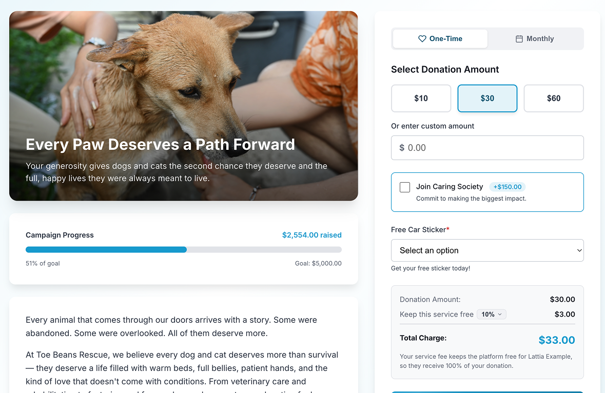 Lattia pre-selects the second suggested amount by default, anchoring donors to a reasonable gift size.
Tie amounts to impact
Don't just show dollar amounts — show what each amount accomplishes:
- $25 — Provides school supplies for one child
- $50 — Feeds a family for two weeks
- $100 — Funds one hour of crisis counseling
- $250 — Sponsors a shelter bed for one month
Impact framing has been shown to increase average gift size by 12–20% compared to plain dollar amounts.
Conversion Killer #3: Slow Page Load Time
Every second your donation page takes to load costs you approximately 7% of conversions. A page that takes 5 seconds to load has already lost a third of potential donors before they even see the form.
This is especially brutal on mobile, where connections are slower and patience is shorter.
How to check your page speed
Go to Google PageSpeed Insights and enter your donation page URL. You'll get a score from 0–100 and specific recommendations for improvement.
Common speed killers on donation pages
- Uncompressed hero images: That beautiful 4MB header photo takes 3 seconds to load on a phone. Compress it to under 200KB using a tool like TinyPNG.
- Too many external scripts: Chat widgets, analytics tools, social media embeds, and tracking pixels all add load time. Your donation page should be lean — remove anything that isn't essential to the giving experience.
- Heavy page templates: If your donation page inherits your full website header, navigation, footer, and sidebar, all that code loads before the form. A simpler, distraction-free template loads faster and converts better.
- Unoptimized payment processing: Some donation platforms load their payment form via JavaScript after the page loads, adding a visible delay before the credit card fields appear. This creates anxiety. Choose a platform that renders the payment form with the initial page load.
Conversion Killer #4: Poor Mobile Experience
Over 50% of nonprofit website traffic now comes from mobile devices, and that percentage is higher for donors who click through from email or social media. If your donation page doesn't work flawlessly on a phone, you're turning away half your potential donors.
The mobile donation page checklist
- Test it yourself: Open your donation page on your phone right now. Try to complete a donation. Time how long it takes. Note every moment of friction.
- Buttons, not text fields: Tapping a $50 button is easy on a phone. Typing "50" into a text field while the keyboard covers half the screen is not.
- Large tap targets: Form fields and buttons should be at least 44px tall. Anything smaller is hard to tap accurately on a touchscreen.
- No horizontal scrolling: If any element on your page causes horizontal scrolling on mobile, fix it immediately. It's the universal signal that "this page wasn't built for my device."
- Auto-advance between fields: When a donor finishes typing their email and taps "next" on the keyboard, the cursor should automatically jump to the next field.
- Show the right keyboard: Email fields should trigger the email keyboard (with @ and .com). Phone fields should trigger the number pad. Zip code fields should trigger the number pad.
- Sticky donate button: On a long form, the "Donate" button should be visible at all times — either at the bottom of the viewport or appearing as the donor scrolls near the end of the form.
Conversion Killer #5: No Trust Signals
You're asking a stranger to type their credit card number into your website. They need to trust that their payment is secure, that you're a legitimate organization, and that their money will be used responsibly.
Many donation pages assume trust. The best ones earn it explicitly.
Trust signals that increase donations
- 501(c)(3) statement: "Your gift is tax-deductible. [Organization Name] is a registered 501(c)(3) nonprofit. EIN: XX-XXXXXXX." This belongs near the donate button, not buried in your footer.
- Security indicators: An SSL certificate (https) is mandatory. But also display a brief note like "Secure donation — your information is encrypted and protected."
- Your logo and branding: The donation page should look like it belongs to your organization. If it redirects to a third-party platform that looks completely different from your website, donors lose confidence.
- Contact information: A visible phone number or email address. The ability to reach a human reassures donors, even if they never actually call.
- Social proof: "Join 347 donors who have supported our mission this year" or a recent donor comment (with permission). Social proof reduces the feeling of risk.
Conversion Killer #6: Distracting Navigation
Your donation page has one job: convert visitors into donors. Every link, button, or visual element that doesn't serve that goal is a potential exit point.
What to remove from your donation page
- Full website navigation: The top nav bar with links to "About Us," "Programs," "Events," and "Contact" gives donors 5+ reasons to click away from the form. Use a simplified header with just your logo (linked to home) and nothing else.
- Sidebar content: News updates, event promotions, social media feeds — all of this competes with the donation form for attention. Remove it.
- Footer links: A minimal footer is fine. A full footer with 30 links is an escape hatch.
- Pop-ups and chat widgets: Nothing kills donation momentum faster than a pop-up asking "Can I help you?" while someone is trying to enter their credit card number.
The highest-converting donation pages are intentionally sparse. They have the organization's logo, a compelling headline, the form, trust signals, and nothing else.
Conversion Killer #7: Forgetting the Confirmation Page
Most organizations treat the post-donation confirmation page as an afterthought — a generic "Thank you for your donation" with no further engagement.
This is a wasted opportunity. The confirmation page is the moment of highest engagement and warmest feelings in the entire donor journey. The donor just gave you money. They feel good. They're paying attention. Use it.
What to put on your confirmation page
- Genuine, specific gratitude: Not "Thank you for your generous donation." Instead: "Thank you, Sarah. Your $50 gift will provide two weeks of meals for a family in need."
- Social sharing prompt: "Help us spread the word — share that you supported [org] today." Include pre-written share buttons for Facebook, X, and LinkedIn.
- Next step invitation: "Want to multiply your impact? Sign up for our monthly newsletter" or "Follow us on Instagram to see your gift in action."
- Monthly giving upgrade: For one-time donors, the confirmation page is the perfect place to suggest recurring: "Want to make this a monthly gift? Your $50/month would provide meals for a family all year long."
The Optimization Checklist
Use this checklist to audit your current donation page. Each fix is independent — you don't need to do them all at once.
| Area | Check | Priority |
|---|---|---|
| Form fields | 6 or fewer required fields | High |
| Suggested amounts | 4 pre-selected buttons with impact descriptions | High |
| Mobile | Tested on actual phone, no friction points | High |
| Page speed | Loads in under 3 seconds on mobile | High |
| Trust signals | 501(c)(3) status, security note, logo visible | Medium |
| Navigation | Simplified header, no sidebar, minimal footer | Medium |
| Monthly option | Recurring giving toggle visible and easy to select | Medium |
| Confirmation page | Specific thanks, share prompt, next step | Medium |
| A/B testing | Testing one element at a time (amounts, copy, layout) | Ongoing |
Before and After: Real Impact
To illustrate how much these changes matter, here's what a typical optimization looks like in practice:
| Metric | Before Optimization | After Optimization |
|---|---|---|
| Form fields | 12 required | 5 required |
| Page load time | 6.2 seconds | 2.1 seconds |
| Suggested amounts | Blank text field | $25 / $50 / $100 / $250 |
| Mobile experience | Horizontal scrolling, tiny buttons | Fully responsive, large tap targets |
| Completion rate | 14% | 31% |
| Average gift | $38 | $52 |
A nonprofit that drives 500 people to their donation page each month would see this impact:
- Before: 500 × 14% × $38 = $2,660/month
- After: 500 × 31% × $52 = $8,060/month
That's a 3x increase in revenue from the same traffic. No additional marketing spend. No new donors. Just a better page.
One Change at a Time
Don't try to overhaul your entire donation page in a single weekend. Instead, pick the highest-priority item from the checklist above and fix it this week. Then measure the result for two weeks before making the next change.
This approach lets you see the impact of each individual change and avoids the risk of breaking something that was already working.
The donors are already coming to your page. They already want to give. Your job is to get out of their way and make it as easy as possible to say yes.